A bridge between African creativity and the world.
ACA came to us as a serious agency with a serious roster — but without a system that could carry its weight on the world stage. The remit was twofold: rebuild the brand so it could hold its own next to global peers, and ship a platform that lets the work do the talking.
We worked from the inside out. Positioning first, then a monogram that could live on a billboard or a business card without losing itself. A horizon palette that nods to the continent without leaning on cliché. A photography direction that makes the talent the headline.
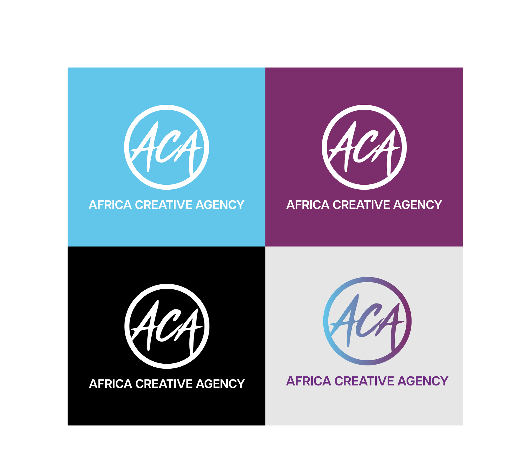
A monogram built for the world stage.
A hand-drawn ACA, sealed inside a perfect circle.
The mark reads as a stamp, a seal, a backstage pass. The script carries the individuality and cultural authenticity of the talent — the circle gives it the structure and global reach of a serious agency. Renders crisp at favicon scale and 12 metres on a billboard. Drops into colour, mono, contained, and uncontained variants without losing what makes it the brand.
One mark, four faces.
The monogram is built to hold its weight across every surface. Full colour where it can sing. Mono where it needs to whisper. Reversed where it has to fight a background. Same proportions, same posture, every time.
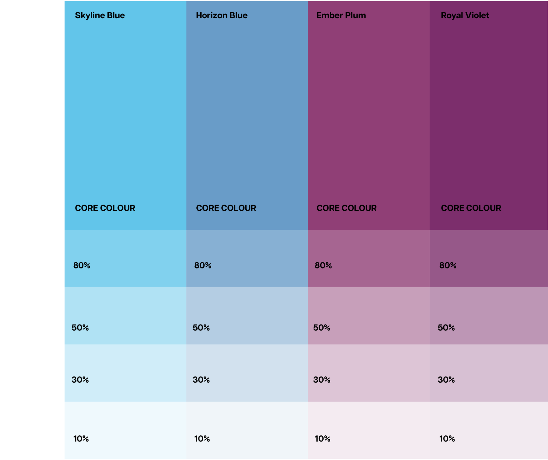
A horizon palette — sky to plum.
Cool enough to feel global. Warm enough to feel African. Four core colours that move through gradient overlays from Skyline Blue at one horizon to Royal Violet at the other.
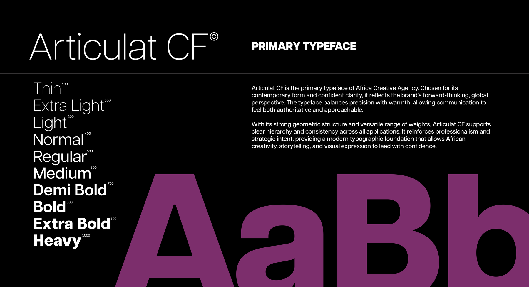
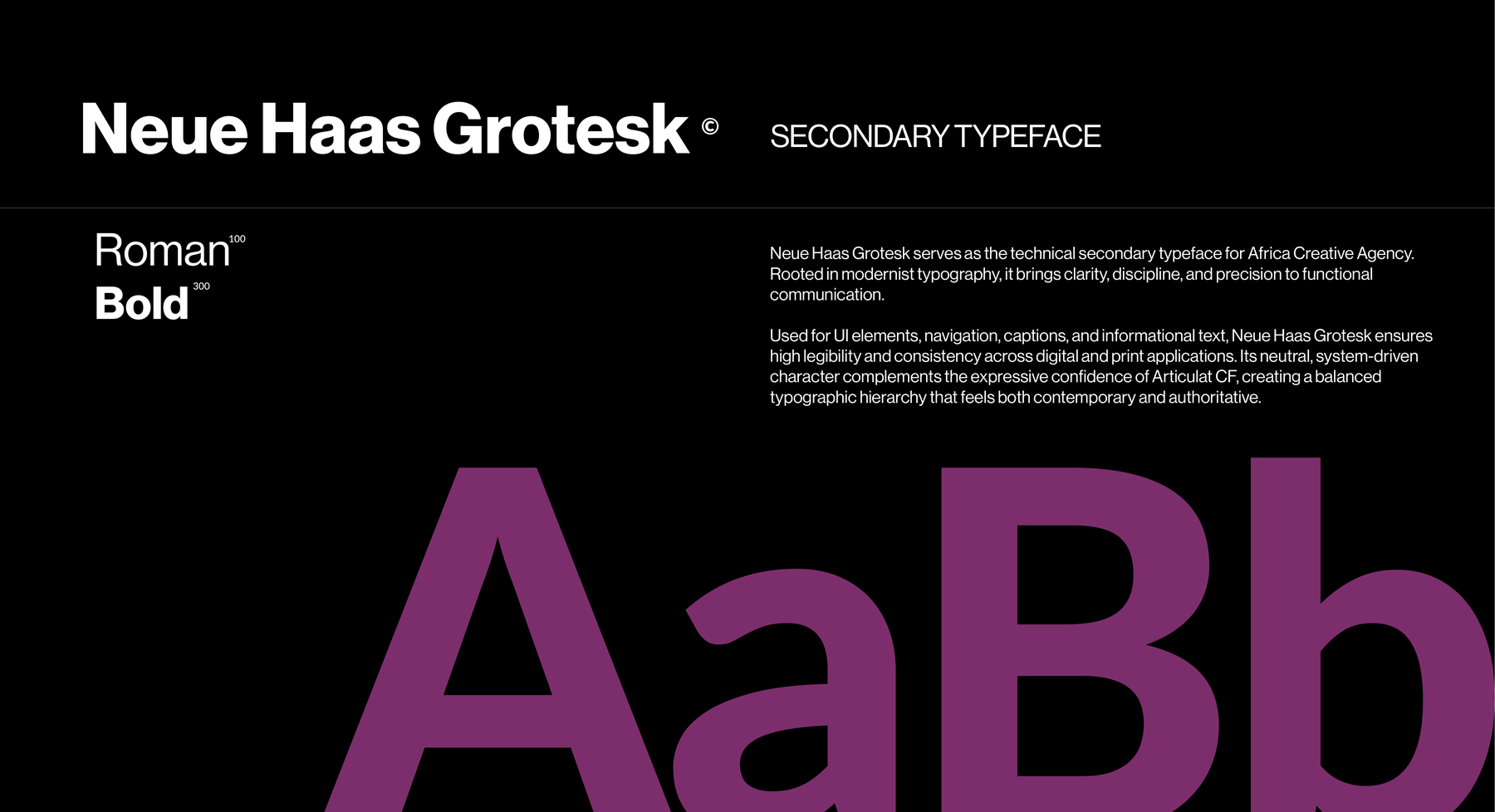
Two typefaces, one disciplined voice.
Articulat CF carries the headlines — contemporary, geometric, confident across ten weights. Neue Haas Grotesk handles the system — UI, navigation, captions — bringing clarity and discipline to everything functional.
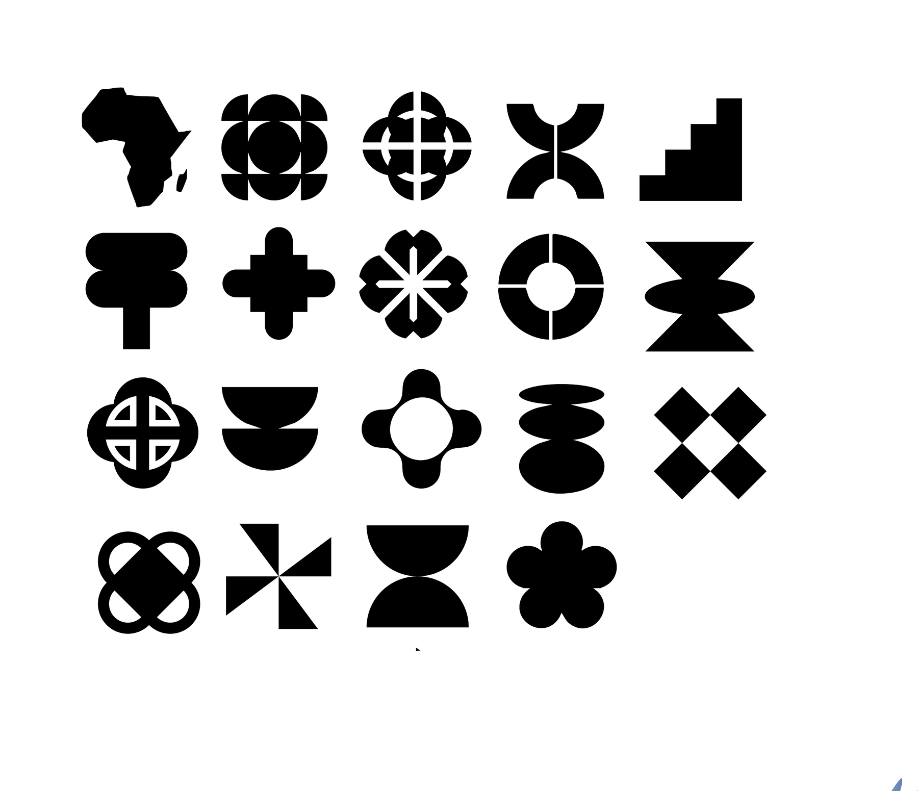
A geometric vocabulary — African, modernist, universal.
A custom icon set built on clean lines and consistent stroke weights — drawing from African form language and rendered with modernist restraint. Minimal, intentional, and built to live across UI, print, and signage without slipping into cliché.
Built to translate — billboard to business card.
The system had to scale. Out-of-home where the talent is bigger than the logo. Print where the gradient becomes the surface. Digital where the monogram has to land in 80 pixels.
Every application was built off the same set of rules — so a poster in Lagos, a business card in London, and a screen in Johannesburg all read as one agency.
A platform that lets the talent lead.
The website was designed to feel like a portfolio you walk through, not a brochure you scroll past. Full-bleed talent imagery. A rolling marquee that locks the positioning in. Sectioned services that read as a clear menu, not a wall of copy.
From positioning to pixel, every decision routed back to one question — does this make the talent feel bigger? The system, the type, the motion all built to step back and let the work breathe.