The address for African creativity.
Africa House came to us with a clear cultural ambition: convene the global African creative class — artists, designers, founders, culture-makers — at the world's most culturally significant moments. Curated, invite-only, city-agnostic. A roaming "house" wherever the culture peaks.
Our job was to build the brand from the inside out — strategy first — then the symbolic core, the identity system, the content engine, the digital platform. And to make it travel: a system of activation-specific assets, built fresh for each city the house lands in.
A narrative-led brand, built on belonging.
Every name is a door.
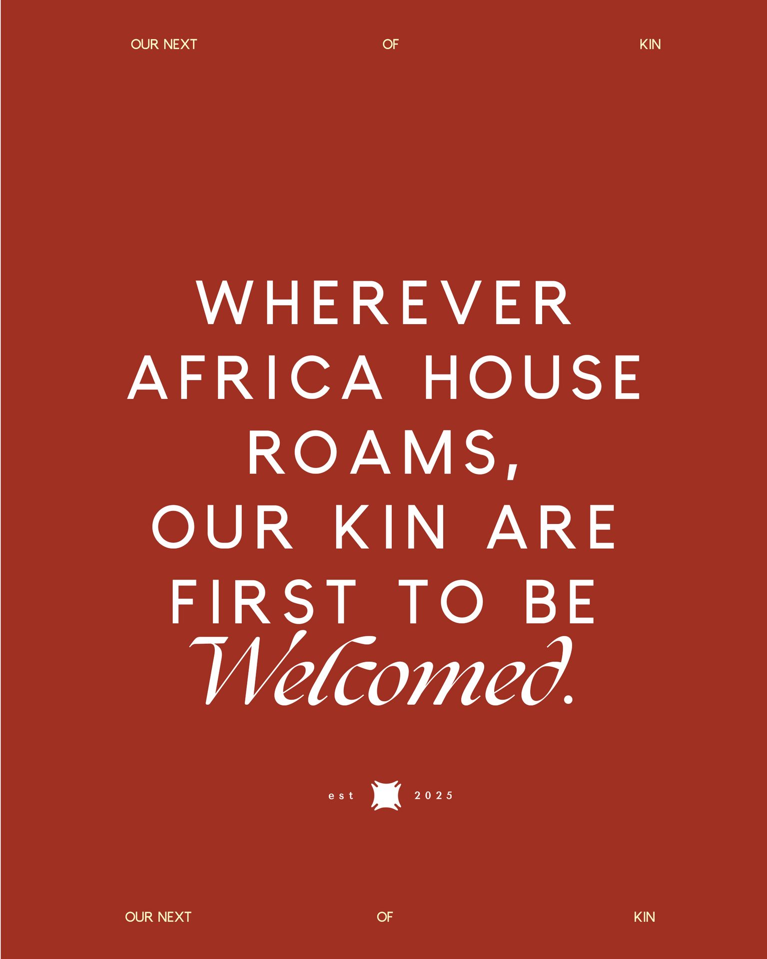
Africa House is a narrative-led brand. The vocabulary we built — Fihankra as the symbol, House Kin and Next of Kin as membership tiers, Kin Tables and Open House as rituals, Bridging and Belonging as the tagline — is the brand's true infrastructure. Each name is a door into how the house actually feels in the room.
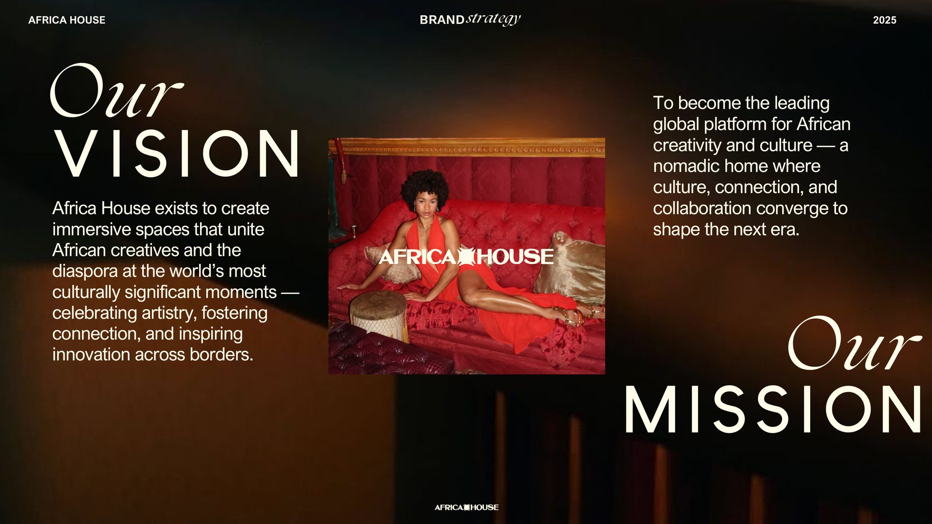
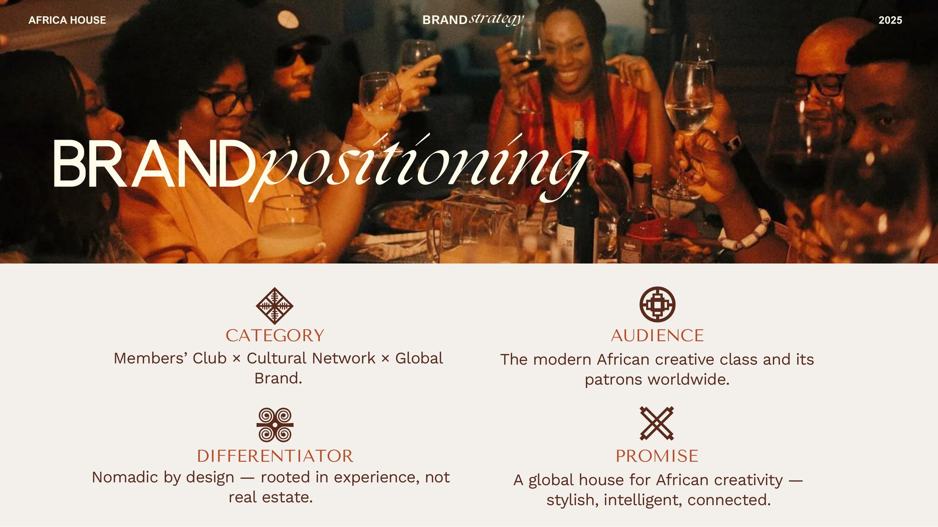
A global house for African creativity.
Members' Club × Cultural Network × Global Brand. Nomadic by design — rooted in experience, not real estate. Built for the modern African creative class and its patrons worldwide.
The Host — who welcomes, connects, and curates energy.
Primary archetype: The Host. Secondary: The Explorer — moves across borders with curiosity and intention. Tertiary: The Connector — bridges talent, ideas and experiences into collective moments.
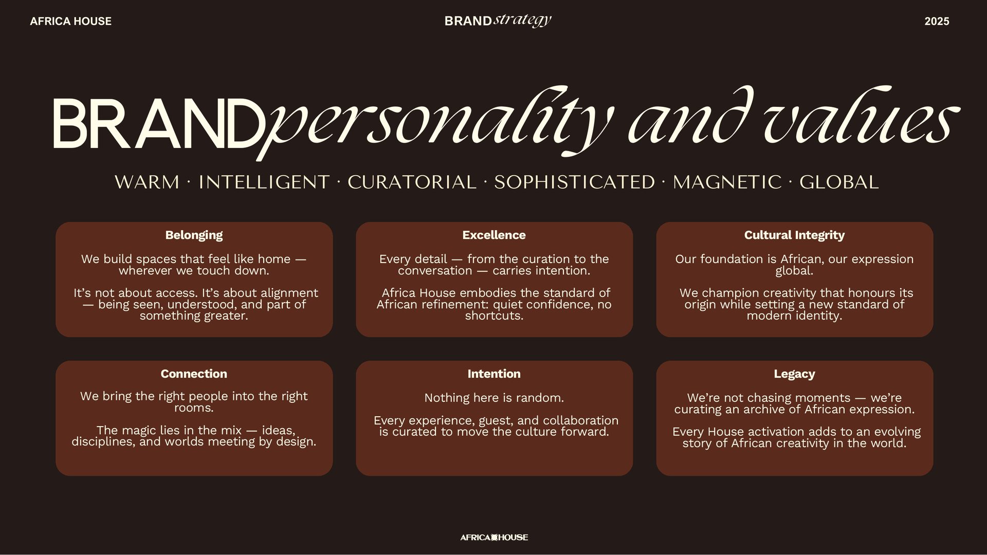
Three modes. One coherent voice.
The Host (warm, confident, grounded in taste) · The Curator (refined, worldly, detail-oriented) · The Insider (minimal words, maximum impact). Sophisticated never elitist. African in essence, international in expression.
A members club without borders.
The brand manifesto crystallises the position: a members club built by Africans who move between worlds, gathering the artists, founders, and thinkers shaping the new cultural landscape — proof that African creativity is not emerging, it's leading.
From symbol to system.
A mark that arrives — and opens its doors.
The Fihankra animates as the house opens. A quiet motion identity that reads as welcome before it reads as logo — same gesture in every city, on every screen.
Compresses to a monogram, holds its weight in mono, renders crisp at any size — from a stamp on an invitation to a 12-metre stage screen.
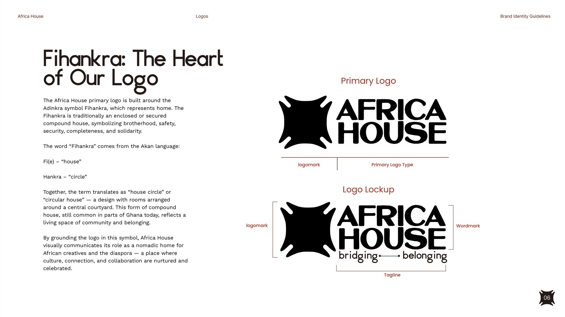
Home — built into the mark itself.
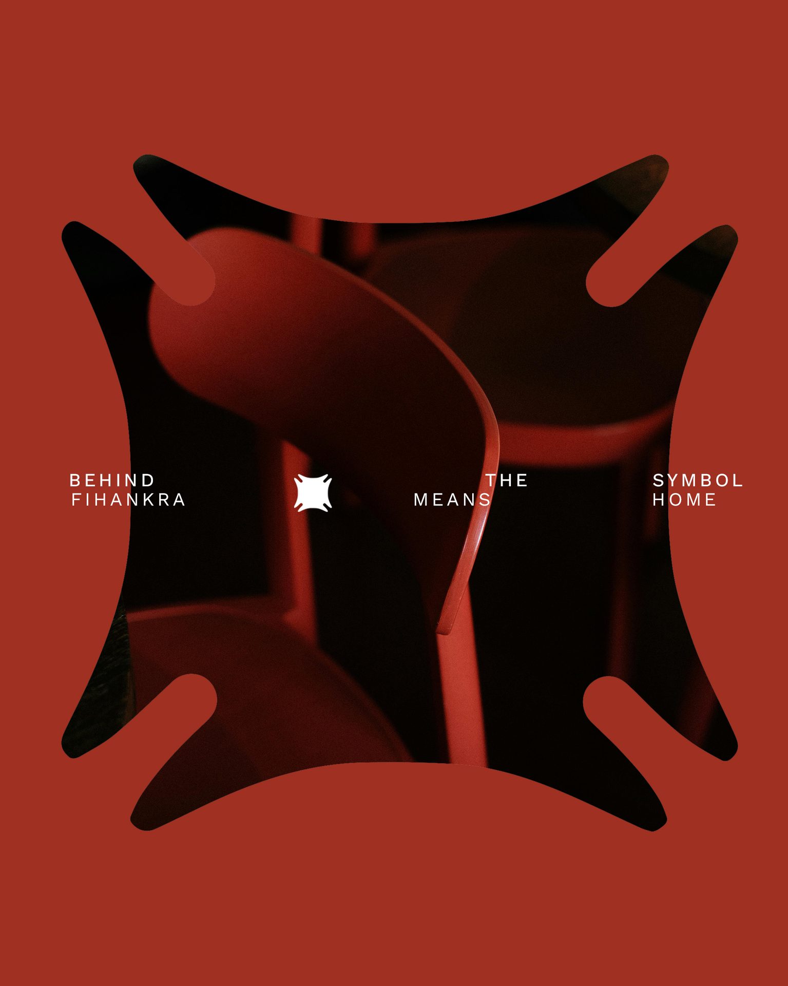
The Africa House logo is built around the Adinkra symbol Fihankra. Traditionally a compound house with rooms arranged around a central courtyard, it carries the brand's core values: brotherhood, safety, security, completeness, solidarity. Fi(e) (house) + Hankra (circle) — together, the house circle, a living space of community and belonging.
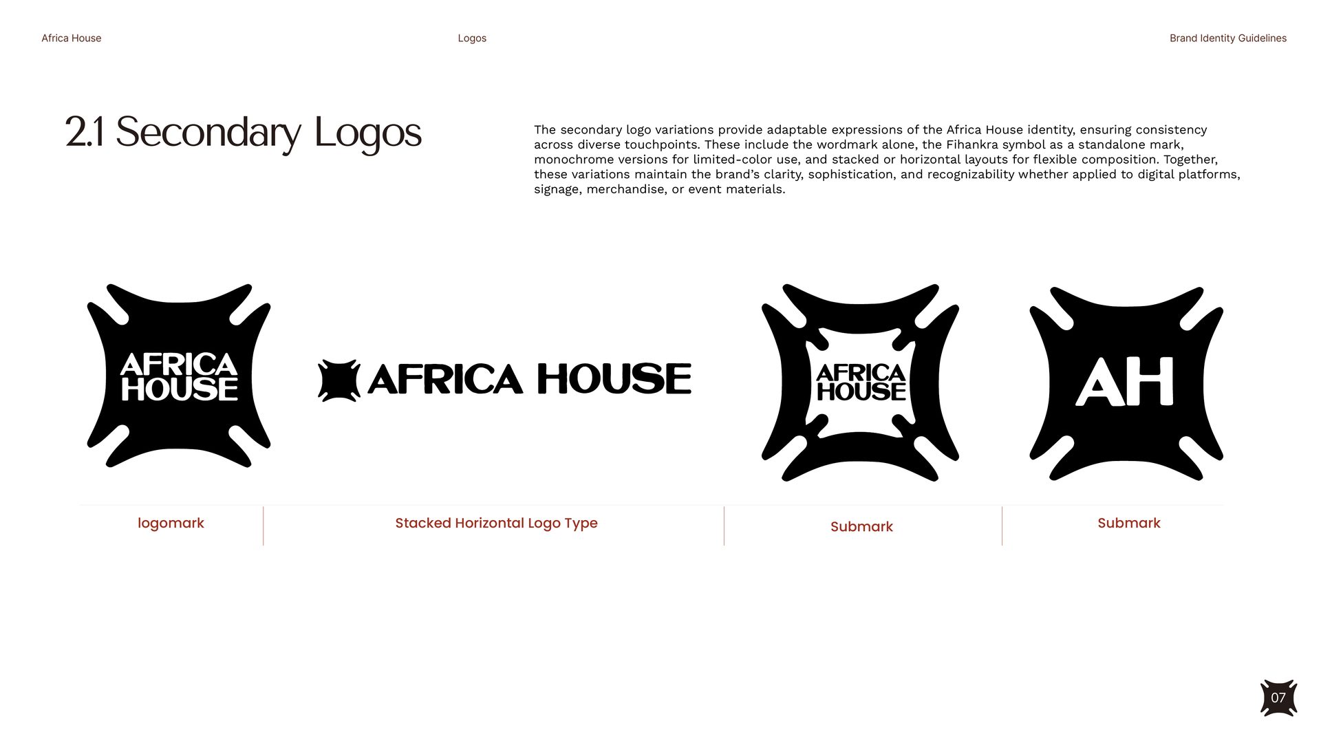
One mark, every surface.
Primary lockup, secondary stacked configuration, sub-mark, and AH monogram — every variant built to maintain Fihankra's safezone and the wordmark's clarity. The system flexes across digital, signage, merchandise and print without ever breaking its posture.
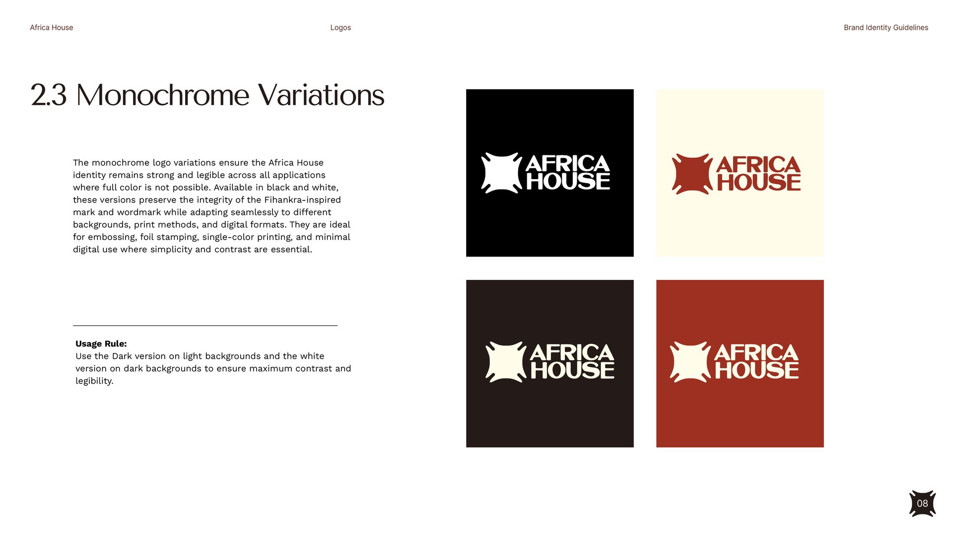
Monochrome states + the protected zone.
Per the guidelines: dark on light, white on dark — four sanctioned monochrome plates. The clear-space rule, defined by the height of the 'A' in the wordmark, guarantees the Fihankra always breathes.
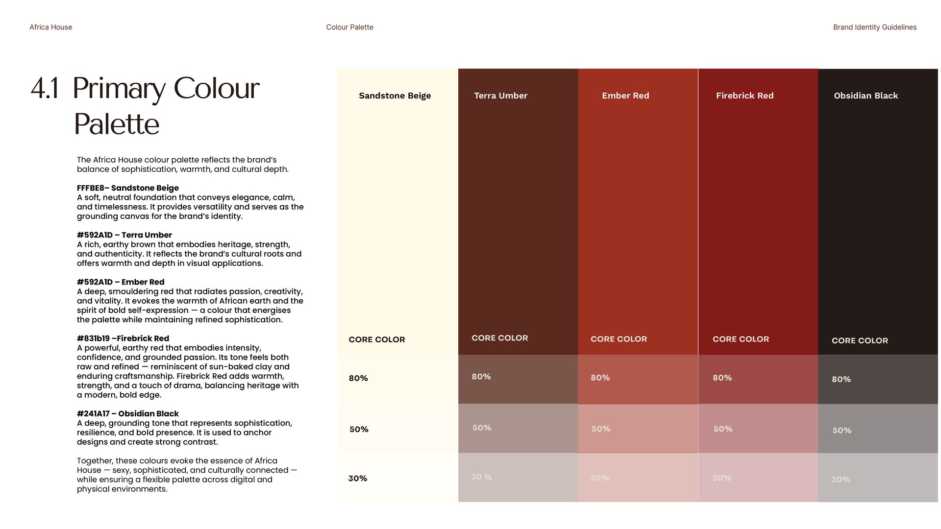
Earth, ember, and home.
Sandstone Beige as the grounding canvas, Terra Umber for heritage and depth, Ember and Firebrick reds for energy and intensity, Obsidian Black for anchor. Built for sophistication, warmth, and cultural depth — together they evoke the essence of Africa House: sexy, sophisticated, culturally connected.
Storytelling colours, for accents.
Faded Oat, Sahara Green, Terracotta Red. The secondary palette adds vibrancy, balance and storytelling range — used for highlights and accents across digital and physical touchpoints.
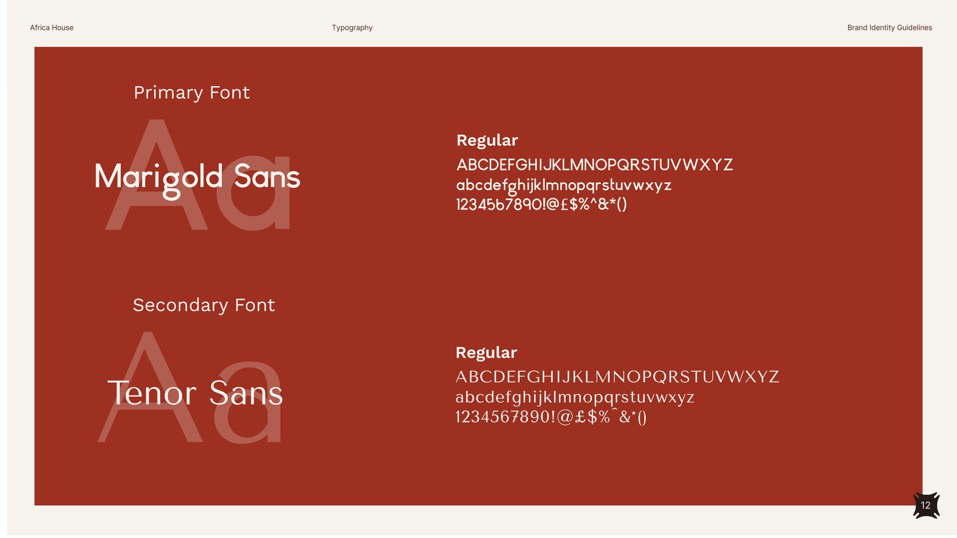
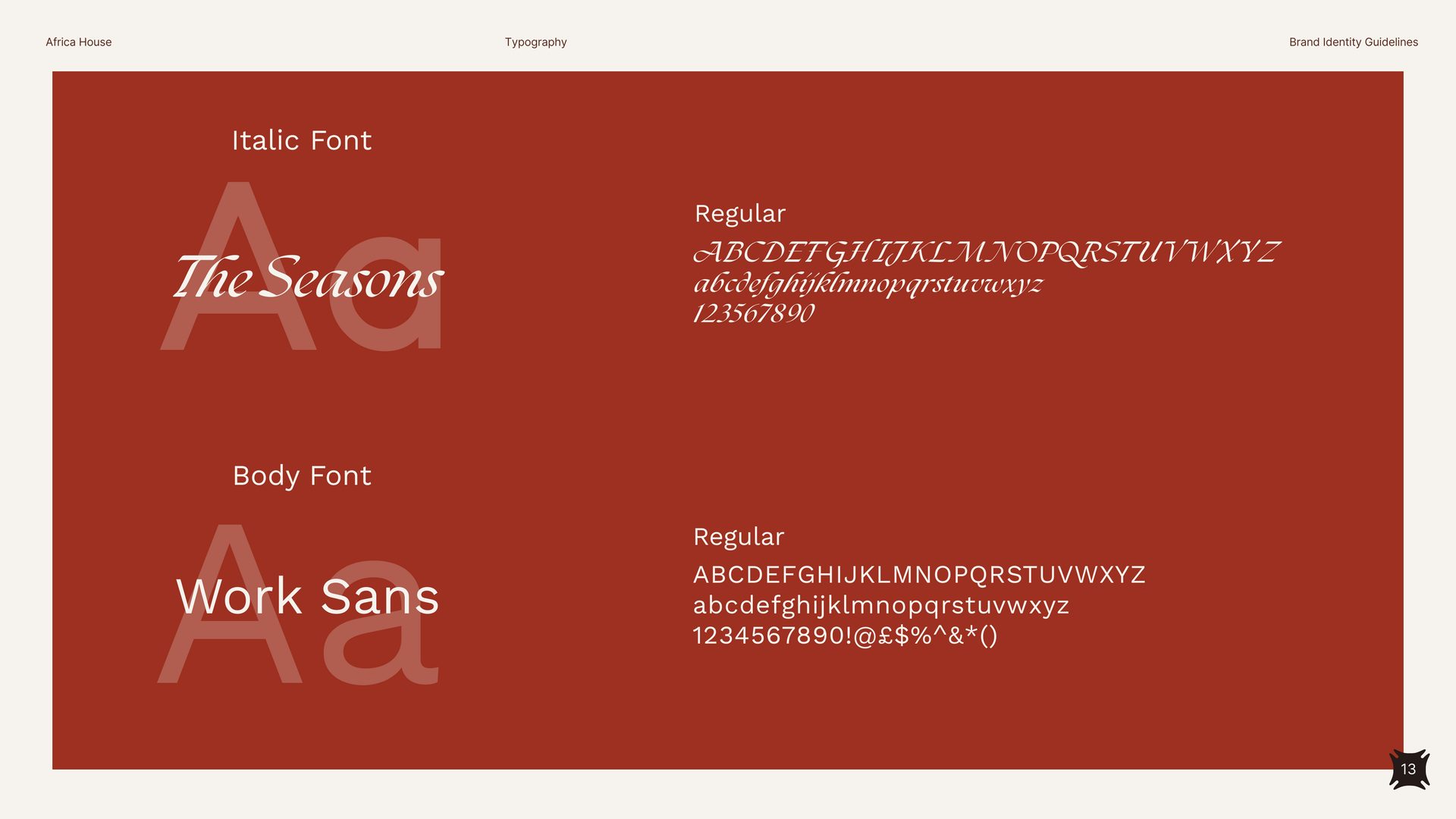
Four typefaces, one editorial voice.
Marigold Sans + Tenor Sans carry the display and H2 register — confident, characterful, geometric. The Seasons italic brings the editorial counterweight, Work Sans handles body and UI with quiet clarity.
A rhythm across the system.
H1 / H2 / H3 / body — each tier with a defined typeface, weight, size and line height. The hierarchy creates the same editorial rhythm whether the brand lives on a poster, a screen or a printed menu.
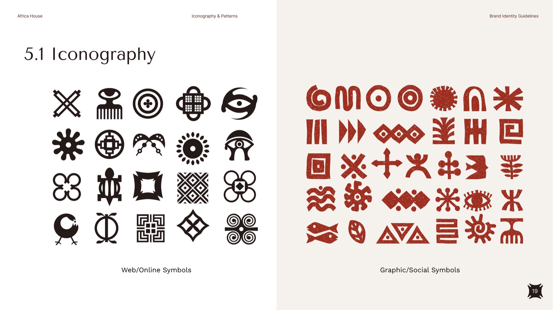
A visual vocabulary drawn from Fihankra.
A custom icon set built on Fihankra's geometry — clean linework, consistent stroke, modernist restraint. Used across UI, print, signage and pattern systems without slipping into cliché.
The house, online.
The platform was designed as a destination, not a brochure. Cinematic photography, light editorial typography, navigation that reads as a guest list — built to do the work of an invitation.
End-to-end design and build — strategy through UX, UI, content, and launch. A digital home the brand can grow inside, city after city.
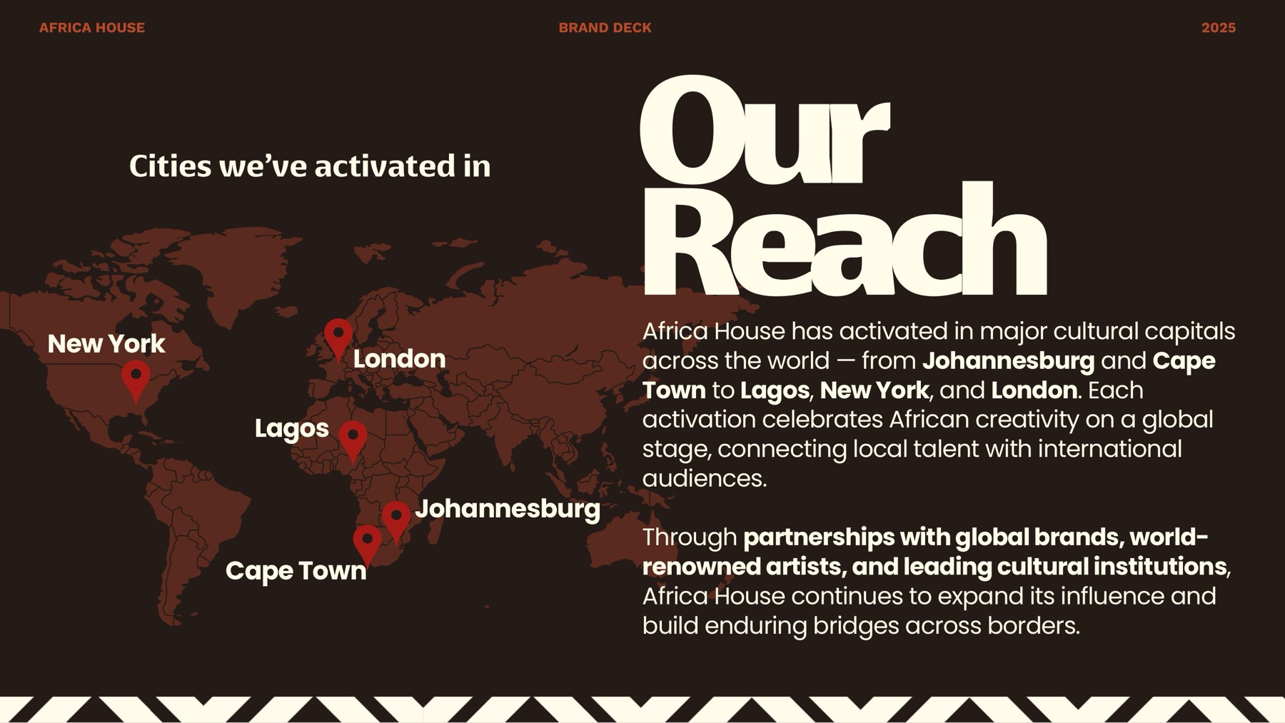
A house that travels.
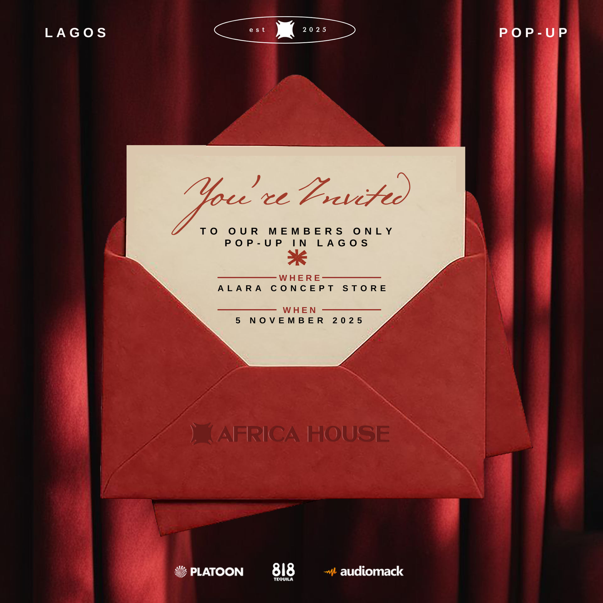
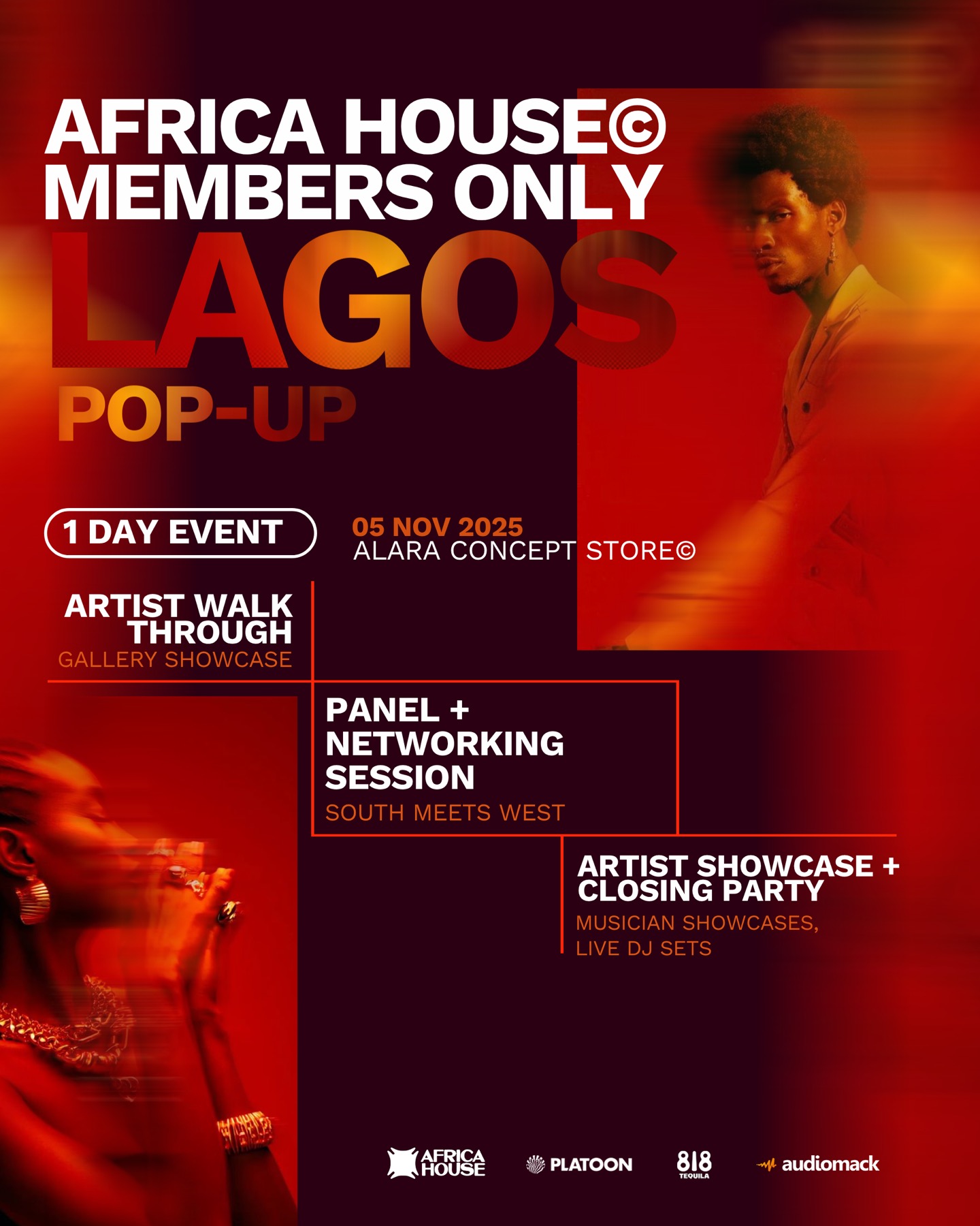
Africa House has activated in major cultural capitals — Johannesburg, Cape Town, Lagos, New York and London — connecting local creative ecosystems with international audiences. Each city its own night, all carrying the same DNA.
The brand, in the world.
A photography direction built for warmth, intimacy and unmistakable atmosphere — the same visual rhythm every city Africa House lands in.
A feed that holds the house — wherever it lands.
Every post a window into the world. The grid reads as one continuous editorial cover — invite, document, archive, broadcast. Instagram as the editorial index, TikTok as the inside lens.
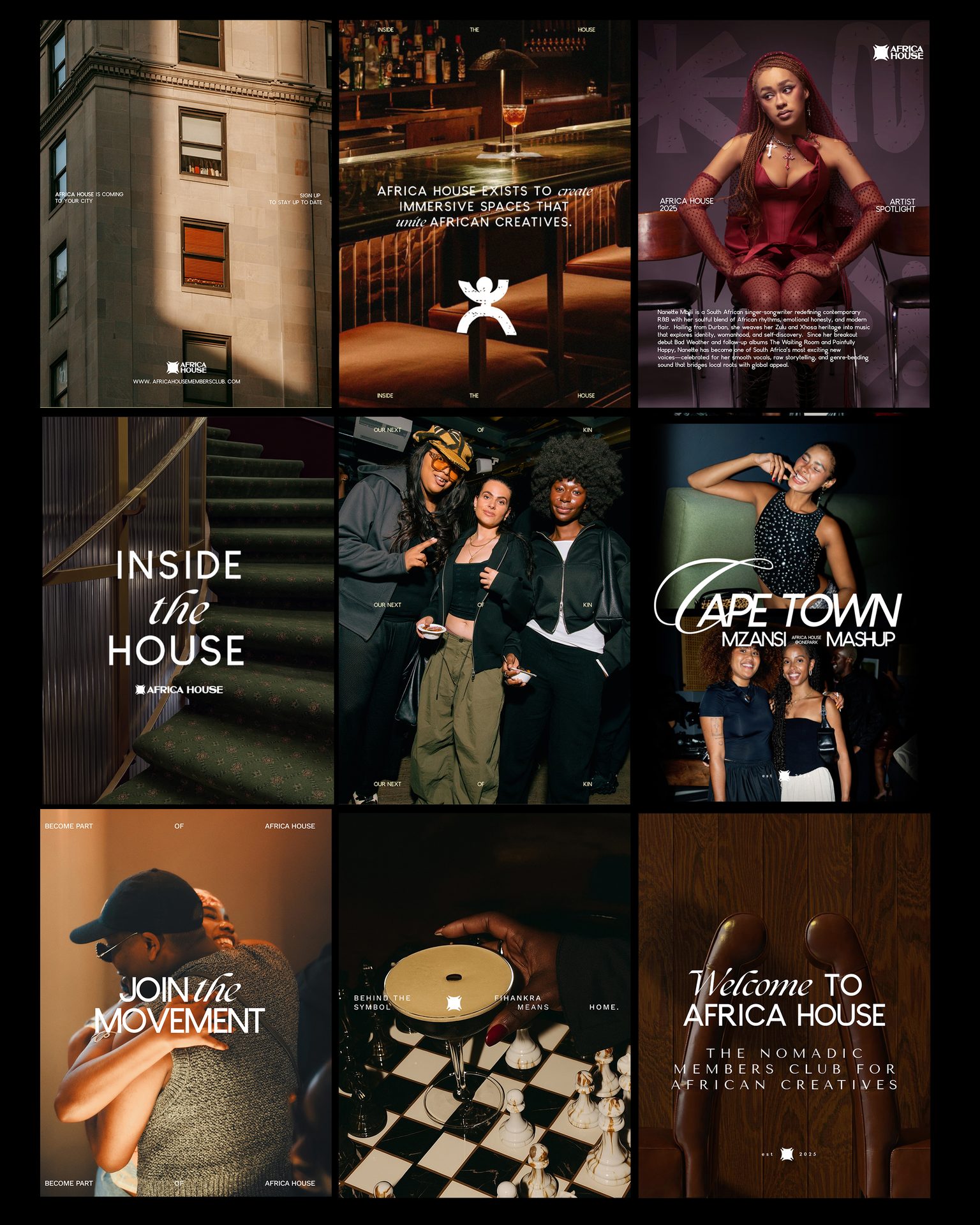
Posts that feel like access — not marketing.
Five content pillars — The House · The Gatherings · Next of Kin · The Exchange · The Culture — built so every activation becomes a chapter in an ongoing story. Static posts, reels and teaser cuts all share the same DNA.
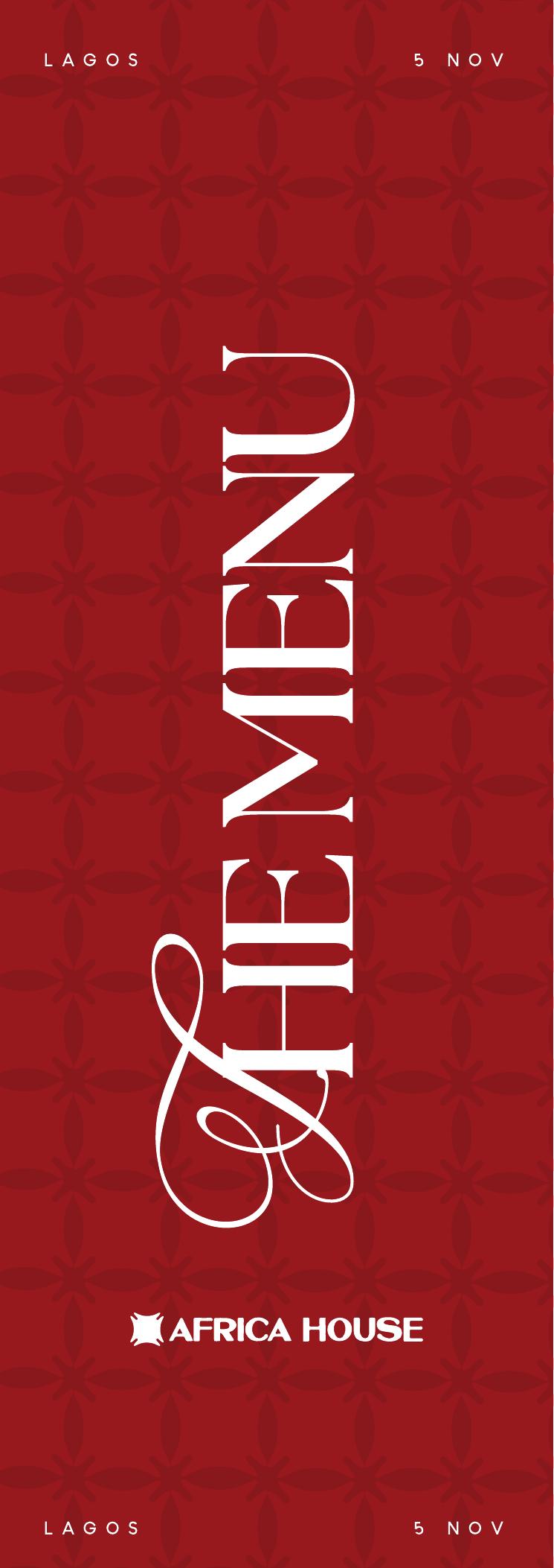
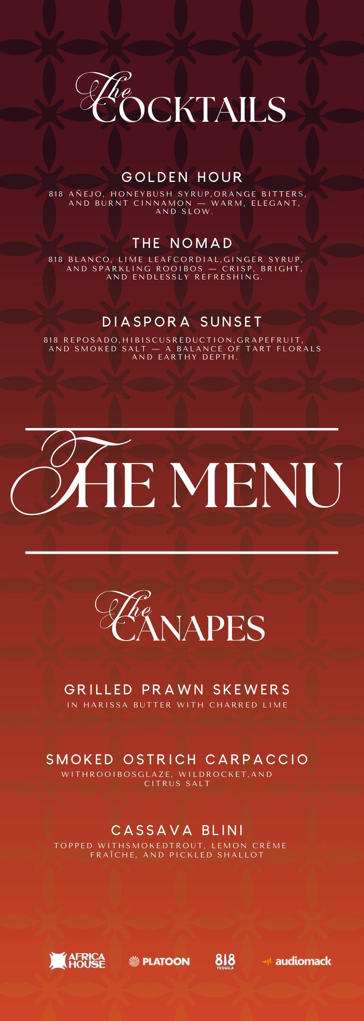
The event kit — digital and print.
For every activation we built a bespoke set of event assets — invites, menus, posters, on-the-night print — designed to extend the brand world from screen into the room without breaking its rules. Same DNA, every city its own night.